Freemium onboarding & activation project
Stotles, 2025
My role: Initiated and led the research; coordinated a small cross-functional team and designed quick solutions to improve the activation rates of freemium users.
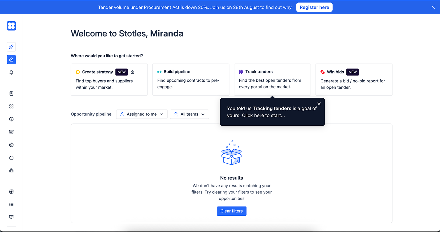
Free-user activation had been flatlining. After the company's rebrand, the team had added UserFlow guided journeys to help new users create their first saved view, and had experimented with various paywall placements. None of it moved the numbers. Paywall hits were in the single digits per week. Fewer than 10% of free users saved a notice, which mattered because saving was the gateway to the qualification reports the freemium model depended on.
The activation problem was real enough that it came up in my own job interview as a whiteboard challenge. But once I joined, it kept losing roadmap priority to paid-user features and a major new bid-writing tool. It was a known problem that nobody had the capacity to own.
Building the case to work on it
I'd been swotting up on PLG and onboarding methods in my own time, and around the same time our demand gen manager (who owned the marketing site, effectively the first step of onboarding) came to me with his own frustrations about the journey. There was clearly something here.
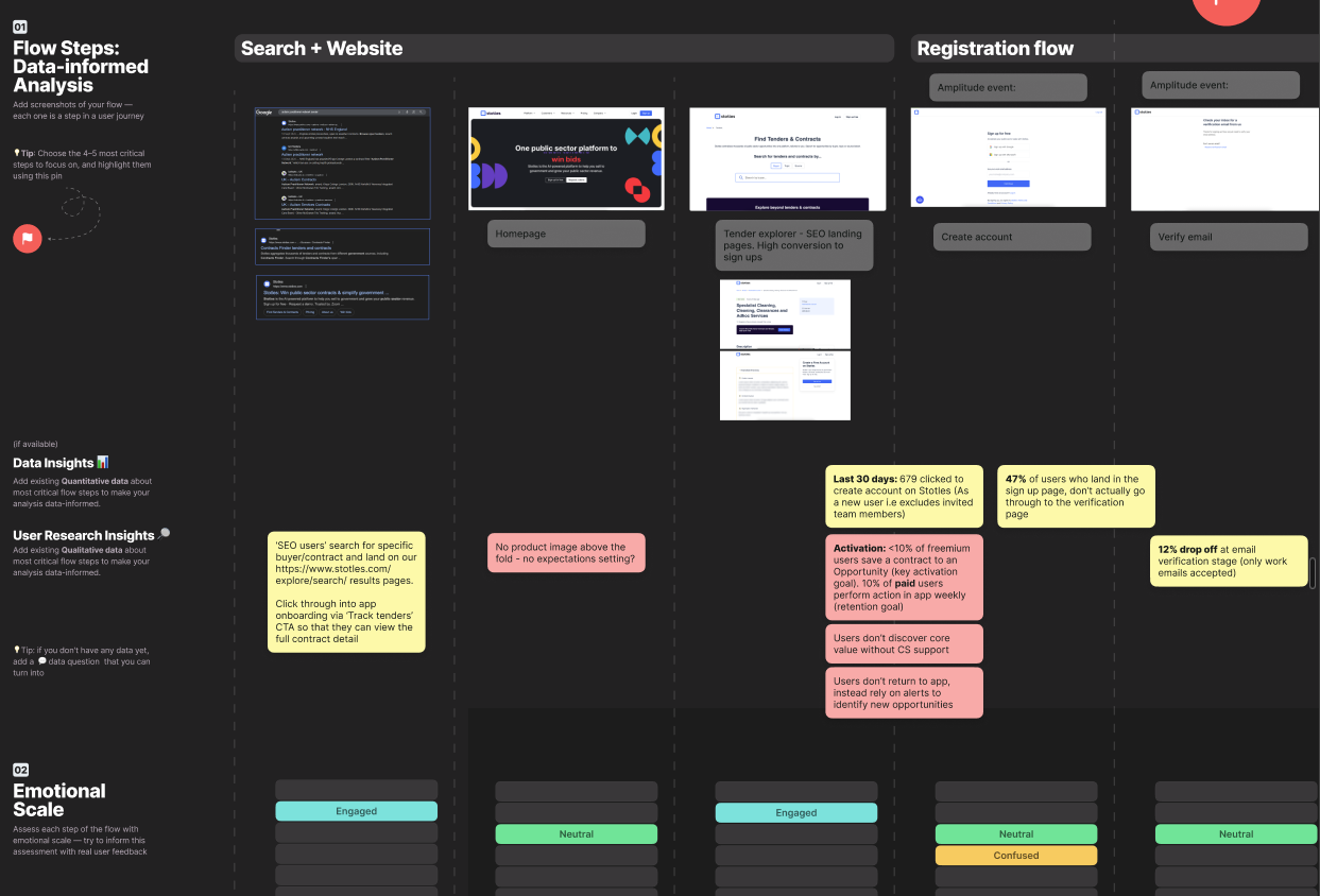
I discussed with our product team and proposed a focused research project on freemium users. I wrote the plan, recruited recent sign-ups while their experience was still fresh, and coordinated a small cross-functional team: one colleague pulled detailed behavioural data on freemium journeys, which we presented to the squad to ground the discussion, while I ran user interviews and mapped the onboarding journey against a five-step framework I'd picked up from a PLG course.
What we found
The behavioural data showed free users were finding opportunities they cared about (a high rate of navigating through to source documents) but not saving them. The UserFlow guided journeys, meanwhile, were going almost entirely uncompleted.

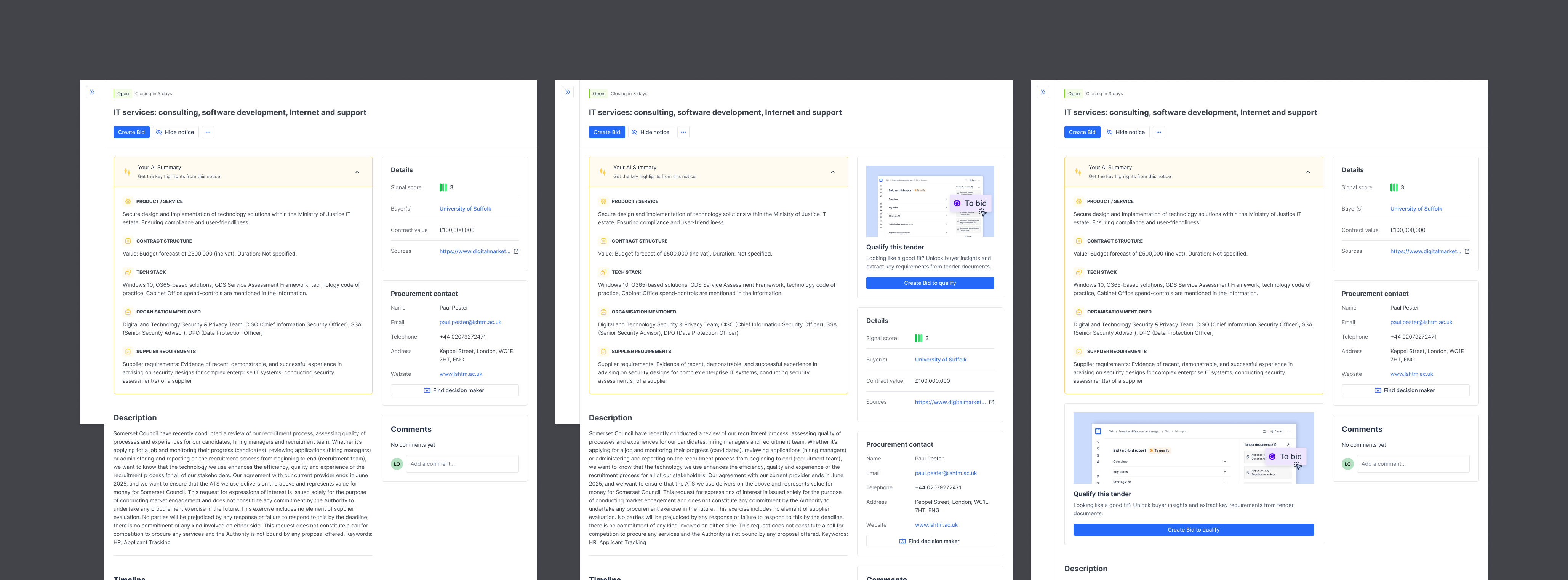
The interviews explained why. Users didn't see the value in saving inside Stotles, because they were already using multiple procurement portals to track opportunities. Saving in one of several tools solved nothing for them, just added an extra step to their workflow. In effect, we were solving the small problem users initially signed up for - but that just made us one of many tools. There was no way for them to discover the actual value, unlocking buyer insights and helping them actually qualify a tender (which was the next step in their workflow, and one of the most tedious for them).
Pragmatic experiments
The roadmap was full, so I scoped solutions that were cheap to ship and could be tested quickly.
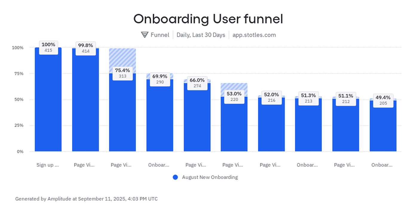
The clearest quick win came from the interviews and the data agreeing: users were confusing the homepage links, clicking into expired contracts when they wanted open tenders. I rewrote the homepage copy to remove the ambiguity and grabbed an engineer to ship it immediately. Click-through on the Track Tenders link rose from around 7.5% to 15% of weekly active free users.
The bigger drop-off was on notice pages, where users would find an opportunity and jump straight to the source document without saving. I ran a two-week A/B test on the placement of new save CTAs against the previous period's baseline. The top-right position drove a 13% action rate against 6% on the control, and shipped to all users.
Through this project I also flagged problems and presented solutions to 3 key stages in the funnel.
- The copy on the landing pages that drove most of our traffic was inconsistent with the actual motivations we identified from users on sign up - I worked with our demand-gen manager to update our marketing pages to improve conversions.
- Registration pages were performing poorly not just on mobile but smaller desktops - I cleaned up these pages and provided fully responsive design considering 40% of web traffic came from mobile.
- Qualification report creation was unintuitive and had poor discoverability - I designed a simplified new report creation flow from Home that would be implemented in the new year, putting a potential key value moment upfront to users.
What it fed into
The deeper takeaway shaped my work the following year. The thing making onboarding genuinely hard was the keyword setup new users had to do before the product was useful. That insight fed directly into the hybrid search project: semantic search meant onboarding could eventually drop keywords entirely, and new users could see real value in their first session rather than after a configuration process. I designed early concepts for that future onboarding state as part of the search work.