Cleaning up the global nav - SaaS
The problem
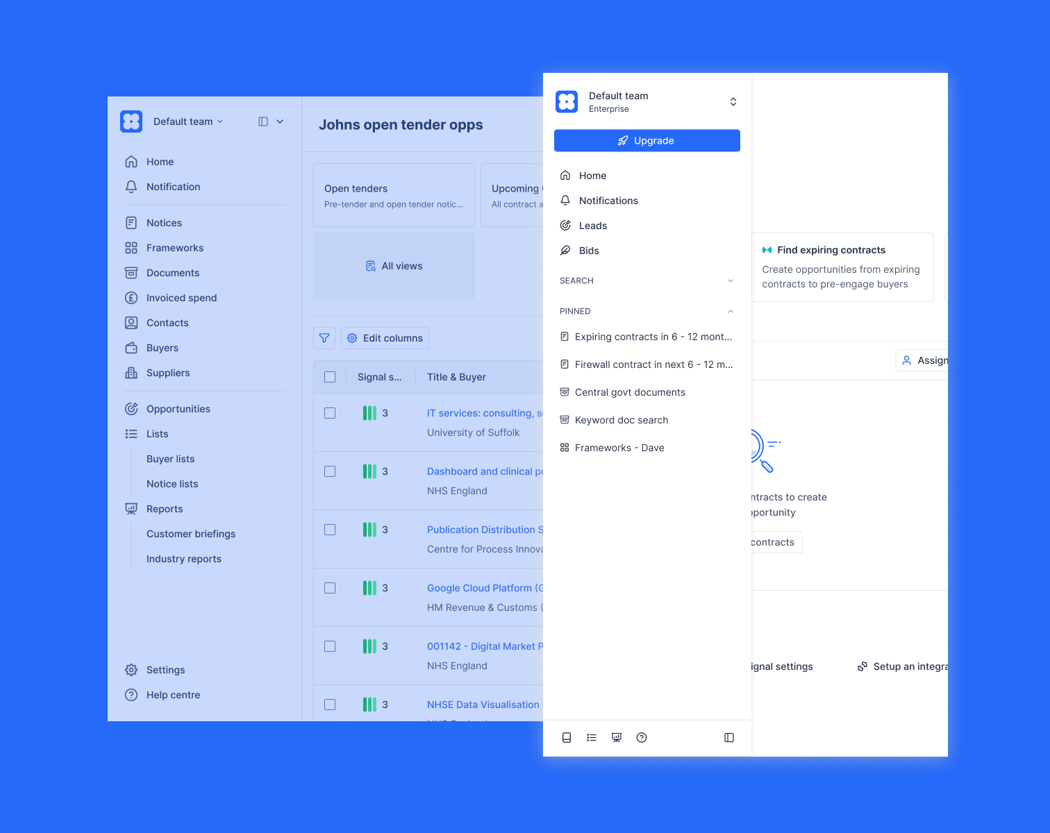
My first project at Stotles was to create a new UI pattern across all our search pages. When I joined, user's pinned saved searches lived at the top of the notice search page, a hierarchy compromise that had been on the team's mind for a while.
My original plan was to move them into the side navigation, following patterns from Notion and Linear. This had the benefit of giving users quick access between searches of any data type (we had 7, from Notices to Suppliers), but it kept getting pushed back behind other priorities, and the new search pages launched without the nav update.
By December, the company was preparing to launch two major new features (Leads and Bids) in the new year. The existing navigation was already cluttered, the hierarchy problem with pinned searches was getting worse, and several CS-flagged users had been frustrated with how saved searches surfaced in their workflow. The cluttered nav also carried a layer of tech debt: custom-built components that broke, nested elements that animated clunkily.
I used a quiet period over the holidays to take this on as a small parallel project, paired with a senior frontend engineer I'd worked well with before.
Prototyping
The engineer flagged the tricky interactions early: the call-to-action button transition from icon-only square to full-width with centred icon and text was the kind of small detail that's easy to mock up in Figma but harder to ship cleanly. That conversation shaped how I prototyped.
Trying out a few tools - Gemini Canvas & AI Studio, and Figma Make - I wanted to prototype the interactions in detail and not just the static states in Figma. I'd used AI tools before for quick experiments, mocking up user flows where the details weren't the focus. But there was a real benefit in working through the complexity of interactions with a fully working prototype. Getting a real feel for the difference in, for example, a divider appearing after a 100ms delay or expanding with the container.
Once I had the prototype where I wanted it (which wasn't so easy - vibe coding the interactions felt like whackamole, fixing one detail broke another like in the example above), I shared internally and with a selection of users for testing before the holiday break. This was the kind of real finickity design work I love doing but don't often have the time for at a busy start-up, where perfect was generally the enemy of good (enough).
What didn't work
The first design used a multi-level navigation structure (bit of an Intercom inspiration), giving each major product area its own dedicated space. Search would have a sub-navigation with each data type and related items. The reasoning was that we were expanding our product offering and each section deserved its own clean section, with room to grow.
It didn't survive contact with real workflows. Jumping from a search page (where a user would be reviewing new tenders) to their list of bids (where saved tenders went) was too many clicks and felt frustrating to users testing the prototype.
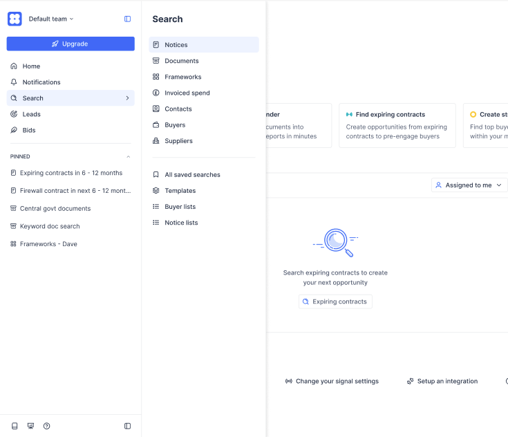
I sat with the engineer one afternoon and we agreed on a cleaner version: a single navigation with nested elements, open by default to encourage discovery of data types, with the ability for users to hide sections they didn't use (a bid writer rarely needs the nested search pages, for example).
What shipped
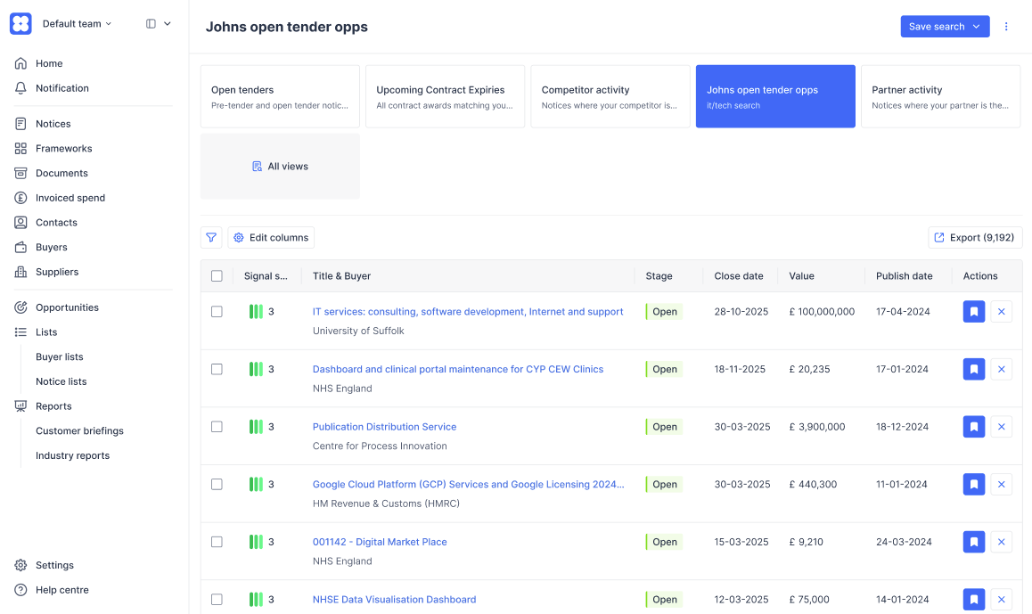
The new navigation shipped in early January, ready for the Leads and Bids launch. Once we had the prototype concept, we leaned into using shad.cn blocks to keep performance and accessibility stable, only customising when absolutely necessary. Pinned searches got the prominent home users had wanted. Remaining piece of the search page redesign finally resolved. The navigation hides sections for users who don't use them. My Eng colleague was relieved to finally clear out years old tech debt. We both took real ownership of the project, away from the pressure of other projects. So we took time to add little quality of life improvements, like making the nav width customisable (lots of users had very long search titles), keyboard shortcuts, tooltips that only appeared on truncated text and pinned item reordering.
After launch, I used Claude Code to push smaller iterations directly. I'd noticed users accidentally opening the nav by hovering past it, so I tweaked the hover delay to make it less twitchy. I also moved signal settings into the top dropdown to save users a extra click for a fairly common use case.
Trade-offs
The new structure deprecated some features the team didn't want users relying on, including the existing Lists pattern. A handful of long-term users and CS team members pushed back on this. The feedback was real and I took it seriously, but a navigation has to support the most important user journeys through hierarchy, not surface every legacy feature equally. Holding that line was the right call structurally even though it cost us a few unhappy conversations in the short term.
Overall, a really nice smooth project. Great example of design and engineering pairing early and often, where I also got to pick up a few new skills for my toolkit.